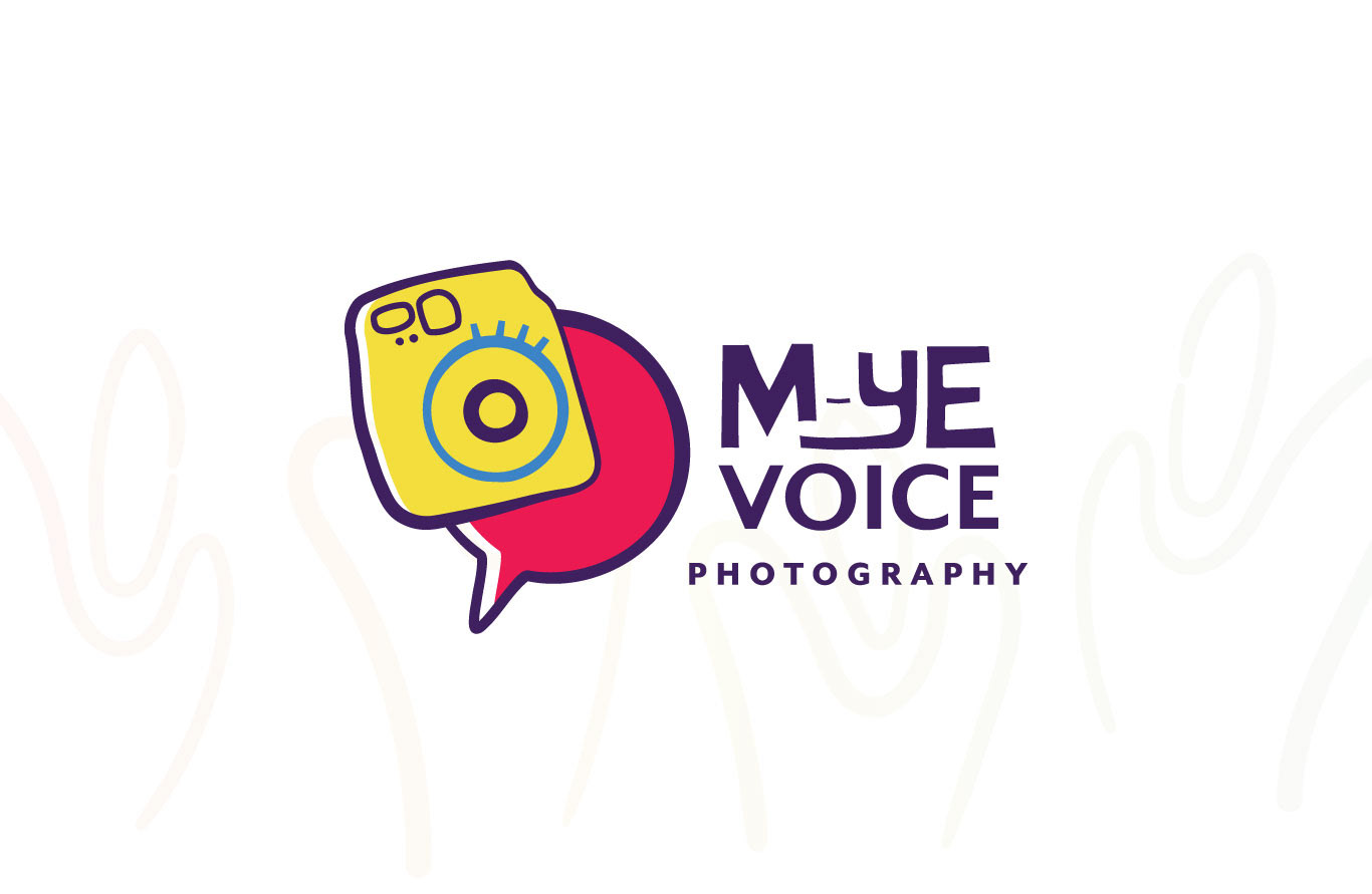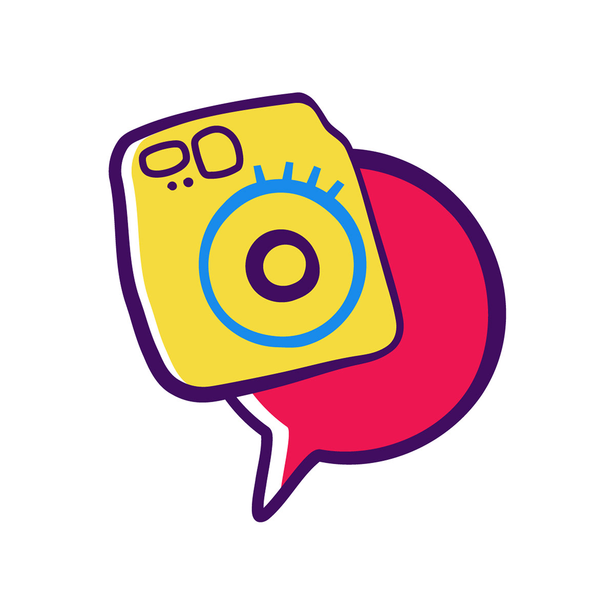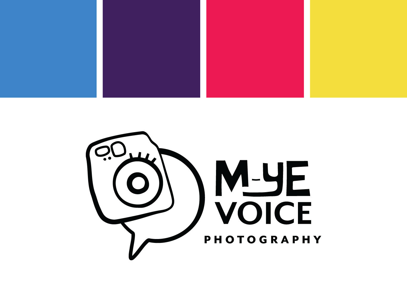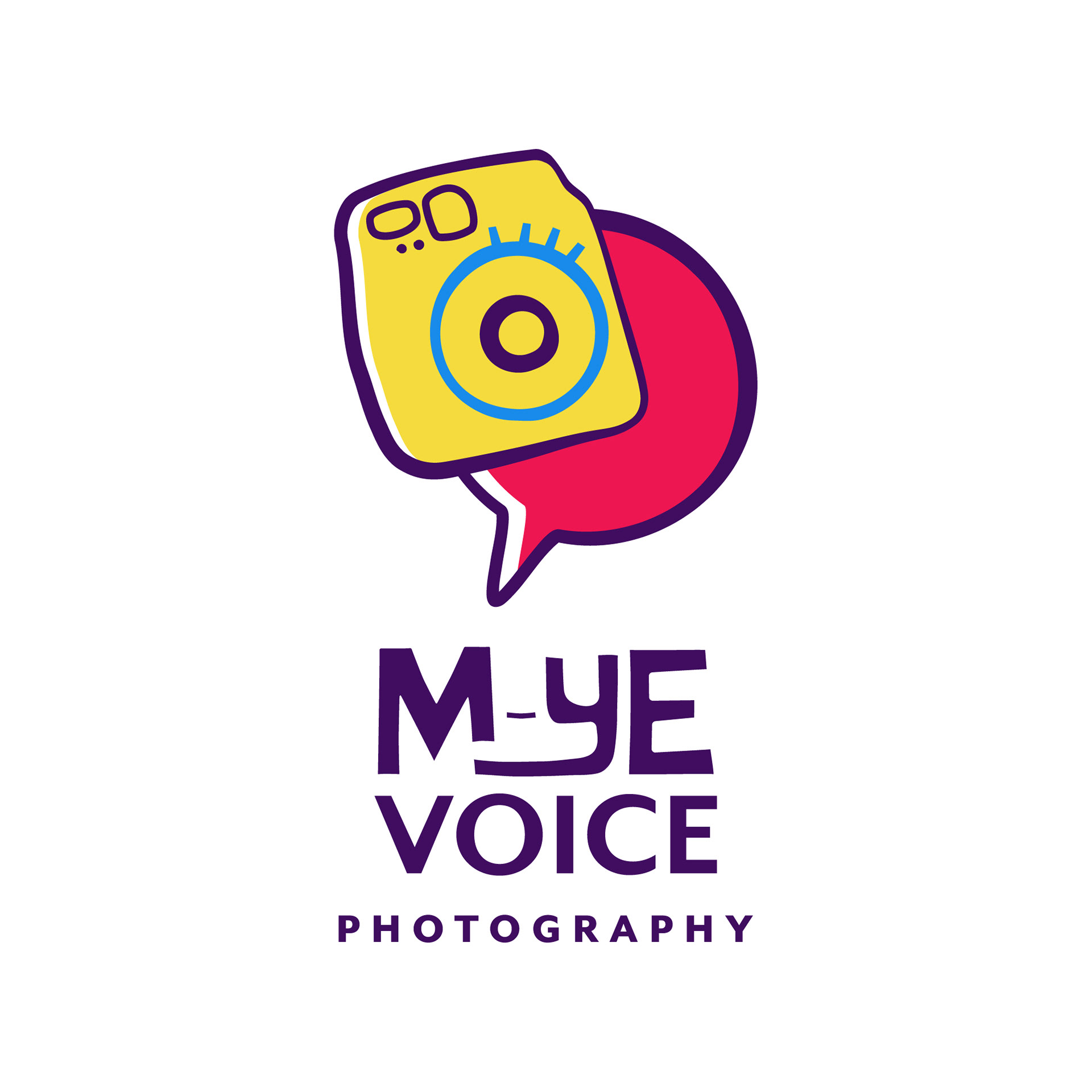
M-ye Voice Photography
M-ye Voice is a photography workshop for kids with special needs, based in the UK. The project called for a logo design that reflected communication, expression and connection with the world, through photography.
During the research phase and through communication with my client, I learned that children with special needs are often sensory avoidant. They experience sensory input more intensely which can often feel overwhelming. The use of vibrant and saturated colors expresses that very experience which played a big role in the design direction.
Pinks, often associated with nurturance and compassion express the very qualities needed when working with SEN kids and helping them learn to express themselves and connect with others.
Purples, while sometimes perceived as regal, also represent stability and balance, especially mentally and emotionally. These were the two main colors I noticed being used by other organizations that worked with SEN kids and found it fitting for this design.
Target Audience: Non-profit organizations that work with SEN kids
Deliverable: Logo Design