Understanding Childhood Trauma and How to Let Go
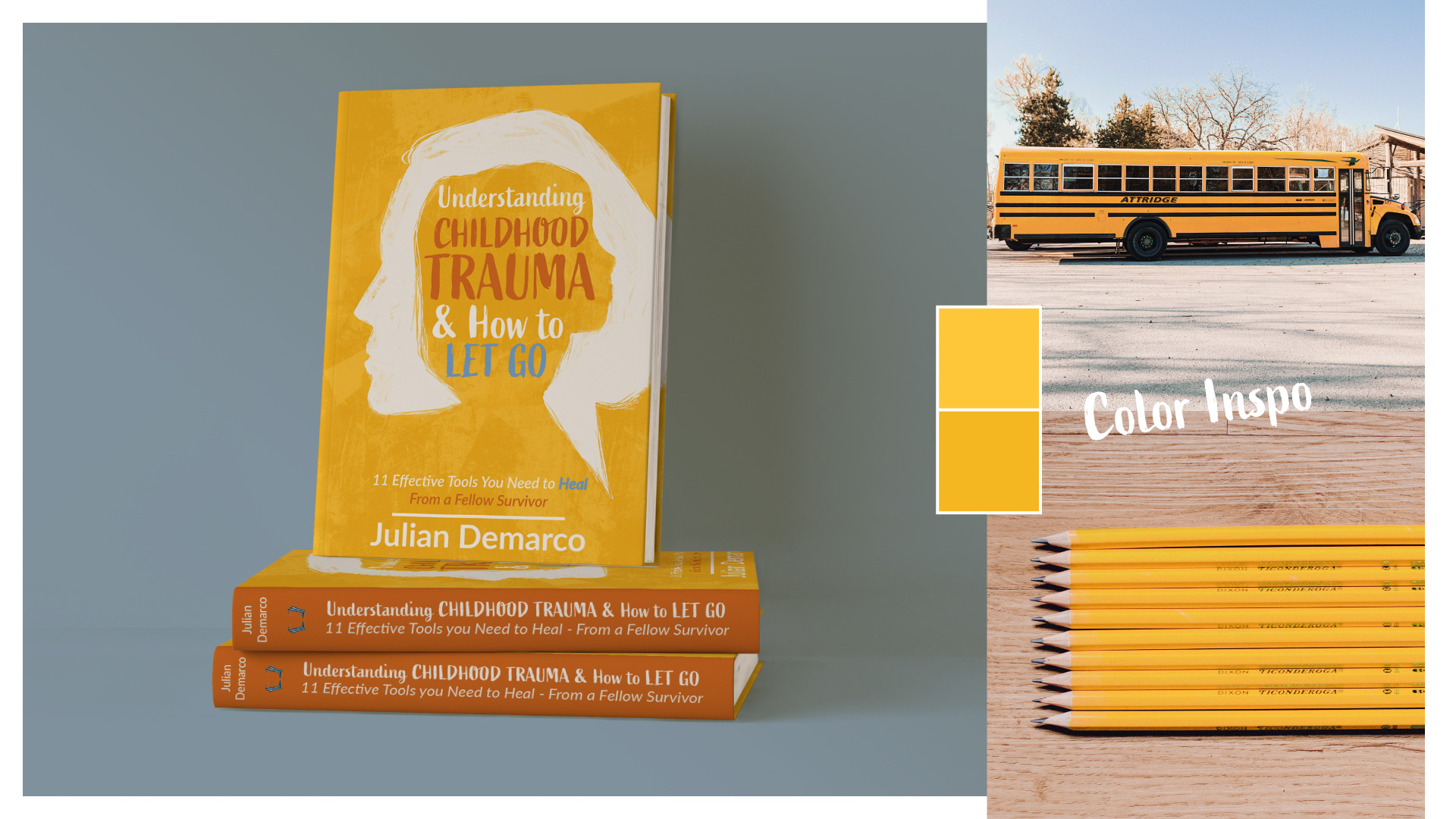
The brief called for a book cover design that stood out from the competition. Instead of dark colors and black backgrounds, the client expressed he wanted a cover that was colorful, warm and heartfelt.
Target audience: Teens and adults who experienced abuse and childhood trauma.
Deliverables: Book Cover design
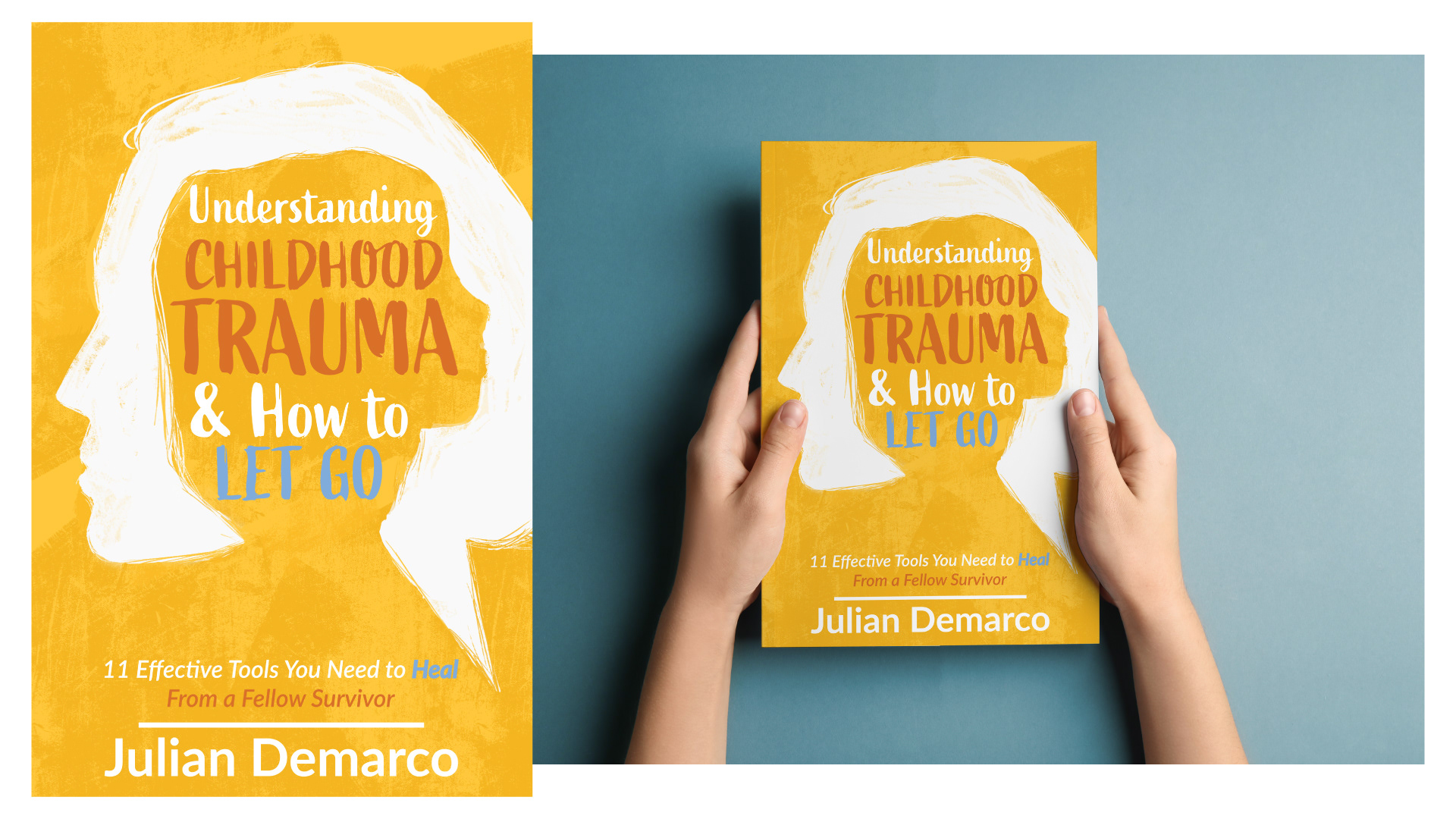
I chose yellow as the background as it's a color of hope. It's also a color often associated with school and learning. In a child's world this can mean yellow pencils or school buses but going a step further, learning how to let go of past traumas. A woman with the silhouette of a little girl inside her head is symbolic to the place where our memories live. However, because trauma often leaves one with a feeling of emptiness and a sense of not knowing who one is beyond their trauma, I purposely left the silhouette blank, white and the little girl inside, in negative space to represent that void. I chose the font for the Title to be placed inside the little girl's silhouette and therefor in a font that feels almost childlike. The word "Trauma" is most prominent to emphasize not only what the topic of this book is, but what a big impact trauma can have on one's life.